ShopDreamUp AI ArtDreamUp
Deviation Actions

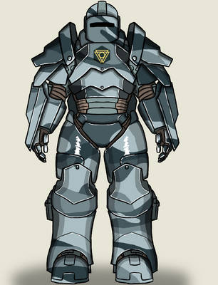
Let's look at yet another Imperial Soldier. This isn't really a guide, per se, just a look behind the scenes.
 by Sulemania")
The shading is mostly similar to the previous one. What's a bit different are the highlights.
 by Sulemania")
I tried to find the long, narrow shapes in the helm. I then added a metallic gleam effect along those lines. This really helps set apart metal as a material in your design. If you actually bother to put highlights on other materials in your design, good for you! I'm lazy.
...I know that might sound a little weird coming from someone who's currently telling you how to spend an ungodly amount of time on stupid details in your Heromachine images, but it's true.
Let's look at her axe, now.

See how it shines?

I've got bad news for you: Sometimes you will mess up. See that hand gripping the handle? See how the shading on the handle overlaps the hand? I noticed that too late. It's an unfortunate side effect of how masking hand items works in Heromachine 3: Though the hand looks like it's on top of the axe, it's actually *below* the axe in the layers.
Also note how shading caused those weird white rings around the studs to appear. Masking in Heromachine 3 is WEIRD. This is why I told you to avoid it when you can.
This time the shadows serve an additional purpose: They can be used to further emphasize the highlights and gleam. The dark part of the blade contrasts the highlighted edges. The gleaming edge evokes sharpness, which is a good attribute for a blade!
Let's look at her shield, now!

See how it looks like one edge is closer to you?

The reason why it looks that way is because of the shading! That shadow really gives off a sense of depth. Use the shadows, love the shadows!
Those highlights looks a bit scary, but it's actually fairly quick to do. The central stud should shine, since it protrudes from the shield. The edges should gleam a bit, since they're the narrowest part of the shield. The strip of metal from the central stud to the edge is technically a long and narrow part of the shield, so it should be highlighted. It's just compressed because of the angle of the shield!
The shading is mostly similar to the previous one. What's a bit different are the highlights.
I tried to find the long, narrow shapes in the helm. I then added a metallic gleam effect along those lines. This really helps set apart metal as a material in your design. If you actually bother to put highlights on other materials in your design, good for you! I'm lazy.
...I know that might sound a little weird coming from someone who's currently telling you how to spend an ungodly amount of time on stupid details in your Heromachine images, but it's true.
Let's look at her axe, now.
See how it shines?
I've got bad news for you: Sometimes you will mess up. See that hand gripping the handle? See how the shading on the handle overlaps the hand? I noticed that too late. It's an unfortunate side effect of how masking hand items works in Heromachine 3: Though the hand looks like it's on top of the axe, it's actually *below* the axe in the layers.
Also note how shading caused those weird white rings around the studs to appear. Masking in Heromachine 3 is WEIRD. This is why I told you to avoid it when you can.
This time the shadows serve an additional purpose: They can be used to further emphasize the highlights and gleam. The dark part of the blade contrasts the highlighted edges. The gleaming edge evokes sharpness, which is a good attribute for a blade!
Let's look at her shield, now!
See how it looks like one edge is closer to you?
The reason why it looks that way is because of the shading! That shadow really gives off a sense of depth. Use the shadows, love the shadows!
Those highlights looks a bit scary, but it's actually fairly quick to do. The central stud should shine, since it protrudes from the shield. The edges should gleam a bit, since they're the narrowest part of the shield. The strip of metal from the central stud to the edge is technically a long and narrow part of the shield, so it should be highlighted. It's just compressed because of the angle of the shield!
Council Of Whispers
Back when I made superhero stuff in Heromachine, I dreamed up four different characters named Whisper, the joke being that the name was such an obviously cool superhero name that four different individuals in the Congo, Ireland, USA and Finland all independently came up with the same name. They ended up meeting up and forming the Council Of Whispers, helping each other out when necessary.
I'm not gonna upload them in my main gallery because they're old and crude, but I'll show them to you just for fun. Let's take a time machine trip back to 2010!
So, roll call: "Ireland" can turn into a ghost form with appropriate powers and carries a hellf
Heromachine 3 quickie: Binoculars
Just a quick example of how a character can be made to use binoculars in Heromachine. Let's break it down.
The end product.
Here's the same image without the binoculars. Each hand has two thumbs, but the binoculars cover that up, don't worry about it.
Finally, here's how it's actually done. The thumb from the open hand is masked onto a small circle and put on a layer above the "saluting" hand. Tweak the proportions until you feel the hand looks correct.
That's that. I might post more of these quick guides in the future.
Heromachine: Making a mountain climber
Once again, I go over the progress of a design. This time, we're looking at the Mountain Climber.
Started out with an idea of a character climbing some tall object with the help of a rope.
Worked in a background, shifted from a forest to the mountains, tried to keep the clothing as basic as possible to avoid headaches if I had to change the pose or something. Color-coded everything so that I can see which items are part of which larger piece.
Came to the conclusion that the rope didn't look quite right, it needed to be more taut.
Decided to change from the old rope-around-the-waist to a more modern climbing harness. Took a look at some on
Heromachine: Some thoughts on posing
This is just a an assortment of my thoughts about posing a character in Heromachine. If you're into more of superhero style or making cheesecake images, these might not be terribly useful for you.
1) Is the pose physically possible and the body correctly proportioned?
There's only so many ways a person's joints can be arranged, after all. Try not to break your character's bones. Experiment a little with your own body and a mirror. This leads directly into part 2.
2) Is the pose a) static or b) dynamic?
2a) Static
If the character is in a static pose, they should be able to maintain that pose for at least as long as they would pose for a
Featured in Groups


© 2015 - 2024 Sulemania
Comments0
Join the community to add your comment. Already a deviant? Log In